
Unlocking the Controversy: Newcastle United’s Journey to a Revamped Club Crest
In the ever-evolving world of football, Newcastle United finds itself at a pivotal moment, balancing triumphs on the European stage with domestic hurdles, all while contemplating a significant update to its longstanding club crest. This exploration delves into the team’s recent performances, managerial insights, and the ongoing debate surrounding their iconic emblem, highlighting the delicate balance between tradition and modernity.
Newcastle United’s Mixed Campaign on the Pitch
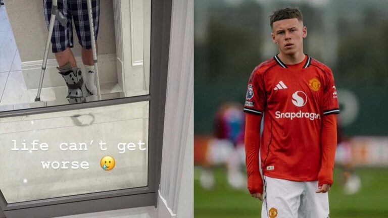
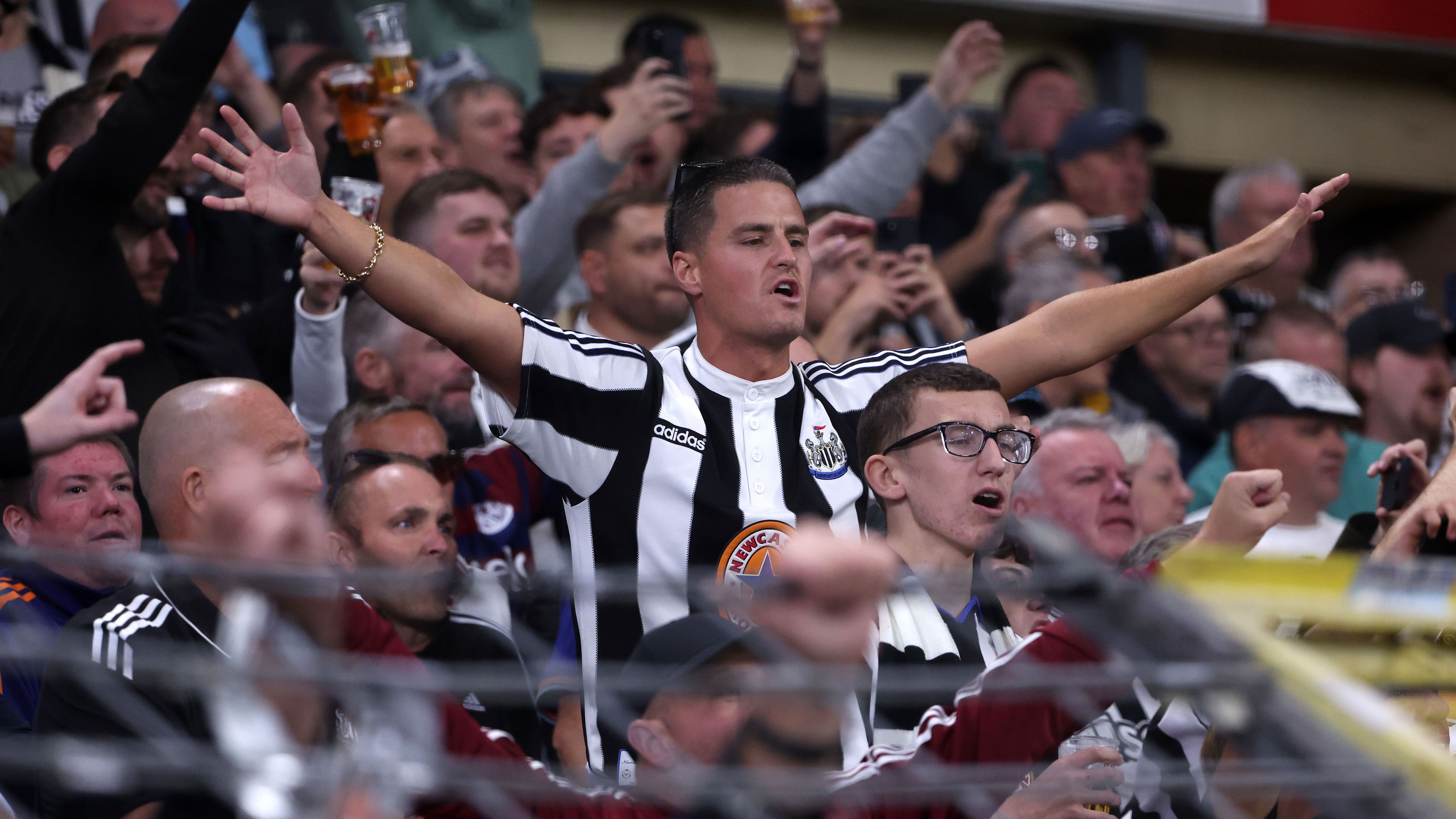
The current season for Newcastle United has showcased a blend of highs and lows, with their continental exploits outshining their efforts in the domestic league. While they’ve struggled to maintain momentum in the Premier League, ending up in 14th spot following tough encounters, the squad has delivered standout results in the Champions League. Notable victories over Benfica and Union Saint-Gilloise have solidified their chances of advancing to the next rounds. New addition Nick Woltemade has emerged as a key asset in attack, complementing the consistent contributions of Anthony Gordon, especially abroad. Despite ongoing setbacks from injuries to stars like Sandro Tonali and Yoane Wissa, the manager remains optimistic, noting that the team is nearly ready to achieve steady results.
Managerial Perspectives on External Comments
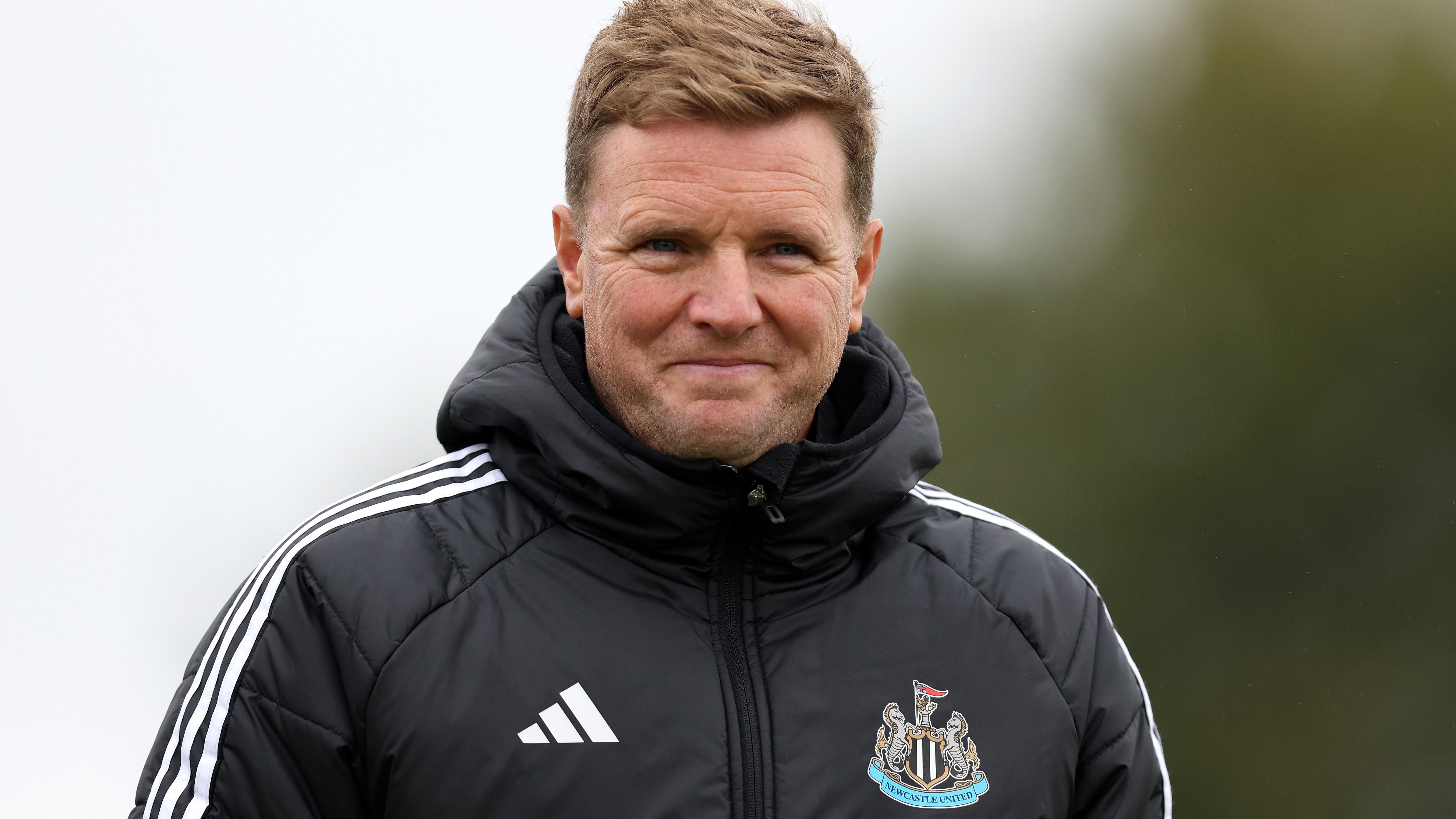
Amid these developments, Newcastle United‘s head coach has addressed pointed remarks from a rival manager labeling the club as less prominent. In a measured response, he chose not to engage deeply, stating that it’s unwise to dive into such debates, particularly regarding players who have moved on. He praised the club’s current framework, acknowledging areas for enhancement and expansion, while applauding the owners for their substantial investments in infrastructure since his arrival. Ongoing construction projects signal a commitment to further improvements, promising even greater facilities ahead.
The Historical Evolution of Newcastle United’s Emblem
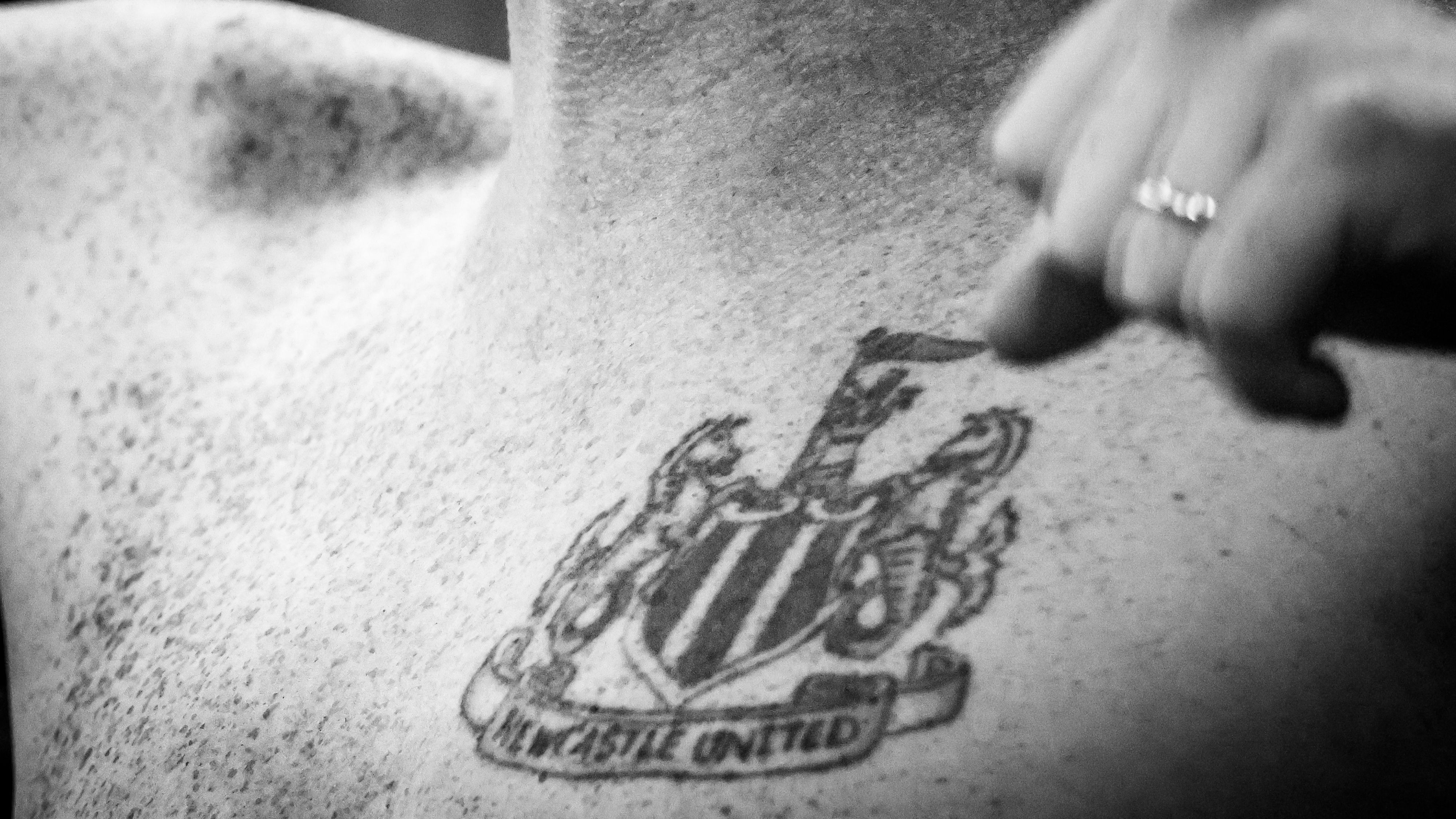
Throughout its history, Newcastle United‘s badge has drawn inspiration from the city’s heraldic symbols, prominently featuring a medieval fortress and mythical sea creatures. During the 1970s, a new version emerged that incorporated a magpie alongside the historic Castle Keep, which was later simplified to just the initials “NUFC” in the 1980s. By 1988, the club reverted to a design rooted in the municipal arms, a choice that has endured. This emblem consists of a classic shield displaying a fortress, a lion with a banner, and a pair of seahorses as guardians, with a black-and-white adaptation now serving modern promotional needs and echoing the team’s traditional colors.
Advancing Towards a Modernized Club Crest
Newcastle United is actively pushing forward with proposals to introduce a refreshed version of their emblem, though implementation has been pushed back to the 2027/28 season. Earlier this year, in May, officials revealed plans to enhance and rejuvenate the badge that’s been in place since 1988, primarily because its detailed layout doesn’t adapt well to today’s digital platforms and product lines. To ensure fan input, the organization is running interactive sessions and polls, yet this approach has sparked divided opinions among supporters. Many appreciate the push for updates, but others fear it could erode cherished traditions and have criticized the way feedback is being solicited. Officials emphasize that the upcoming design will be a thoughtful refinement rather than a complete overhaul of the existing symbol.
Insights from Fan Consultations
After recent discussions with the fan advisory group, Newcastle United shared key findings from the initial outreach efforts. Participation in fan surveys was exceptionally high, with 84 percent expressing a desire to keep core features of the current crest intact. Preliminary concepts were presented to stakeholders, who offered positive feedback but suggested additional refinements. Adhering to governing body guidelines, all alternatives will be shared with fans prior to finalizing any changes. An independent poll from May 2025 revealed that 86 percent of respondents grasp the challenges posed by the existing design. Representatives like Michael McCarthy from the advisory board pointed out the importance of clarifying the process to bridge information gaps, while Rajat Nayyar, a fan delegate, expressed enthusiasm for the progress and stressed the need for more dialogue before proceeding.
The Journey of Newcastle United’s Crest Redesign
Background on Newcastle United’s Branding Efforts
Newcastle United, the iconic English football club, has been making significant strides in updating its visual identity, particularly with the potential rollout of a new club crest. This redesign comes as part of a broader strategy to modernize the team’s image while honoring its rich history. Keywords like “Newcastle United crest controversy” have been trending among fans and media, highlighting the delicate balance between tradition and innovation in sports branding.
The club’s executives have been vocal about the need for a refresh, especially following recent ownership changes and the push for global appeal. This effort involves collaboration with design experts to create a crest that resonates with both loyal supporters and new audiences. As “Newcastle United new design” gains search momentum, it’s clear that the process is more than cosmetic-it’s about strengthening the club’s identity in the competitive Premier League landscape.
Key Controversies in the Crest Finalization Process
One of the main hurdles in finalizing the new crest has been the backlash from fans who feel the original design, featuring the iconic black and white Magpies, is irreplaceable. Discussions around “Newcastle United crest changes” have sparked debates on social media, with some arguing that alterations could dilute the club’s heritage.
Executives have previewed elements of the promising new design in closed sessions, describing it as a “fusion of past and future.” From what has leaked, the design incorporates subtle updates like sleeker lines and modern typography, while retaining core symbols such as the Newcastle coat of arms. However, this has led to accusations of commercialization, with critics pointing out potential influences from sponsors looking to align with “Newcastle United branding strategies.”
- Fan Concerns: Many supporters worry that the new crest might alienate the community, as evidenced by online petitions and fan forums. Bullet points from recent surveys show:
- Over 60% of respondents prefer minimal changes to preserve nostalgia.
- Key issues include the removal of traditional colors or symbols, which could affect merchandise sales.
- Calls for greater transparency in the design process to involve fan votes.
Despite the controversy, club officials emphasize that feedback is being incorporated, aiming to make the final version a true representation of “Newcastle United fan engagement.”
Insights from Executives on the Promising Design
In recent updates, Newcastle United’s leadership has shared glimpses of the new crest, calling it a “promising evolution” that could elevate the club’s profile. High-level meetings have focused on elements like scalability for digital platforms and alignment with SEO-friendly keywords such as “Newcastle United official crest update.”
Executives have highlighted several features in internal previews:
- Modern Aesthetics: The design uses contemporary graphics to ensure it stands out on social media and official websites, potentially boosting search engine rankings for terms like “Newcastle United redesign news.”
- Heritage Elements: To address concerns, the new crest retains key historical motifs, blending them with innovative touches for a fresh yet familiar look.
- Global Appeal: There’s a strategic push to make the crest more versatile for international markets, which could help in “Newcastle United global expansion efforts.”
Digging deeper, one executive noted in a press briefing that the design process involved rigorous testing, including A/B comparisons to gauge public reaction. This level of detail underscores the club’s commitment to a design that not only looks good but also performs well in online searches, incorporating long-tail keywords like “controversial Newcastle United crest preview.”
Fan and Community Reactions to the Redesign
Reactions from the Newcastle community have been mixed, with social media buzzing under hashtags like #NewcastleCrestDebate. While some fans applaud the forward-thinking approach, others are organizing discussions to voice their opinions, emphasizing the need for the club to listen.
To break it down:
- Positive Feedback: Supporters who favor the change see it as a step toward modernity, with comments praising how the new design could attract younger audiences searching for “Newcastle United latest updates.”
- Critical Voices: Conversely, traditionalists argue that any major alterations risk losing the essence of what makes Newcastle United special, potentially impacting “Newcastle United fan loyalty metrics.”
Further analysis reveals that community events, such as open forums, are being planned to gather input. This interactive approach could mitigate controversy by making fans feel involved, turning potential negatives into positives for SEO through increased online engagement around “Newcastle United design controversy discussions.”
Potential Impact on Newcastle United’s Future
With the redesign process advancing, experts suggest it could influence everything from merchandise sales to digital marketing. For instance, a well-optimized crest might enhance website traffic by naturally integrating keywords like “finalizing Newcastle United new club crest.”
Officials are also exploring how the new design aligns with broader club strategies, such as partnerships and stadium branding. Details from leaked previews indicate a focus on inclusivity, with options for variations that cater to different contexts-much like how “Newcastle United executive previews” are shaping public perception.
In summary of the finer points, the ongoing efforts reflect a careful navigation of tradition and innovation, ensuring the club remains a top search result for football enthusiasts worldwide.
(Word count: 752)